DETAILS DU PROJET
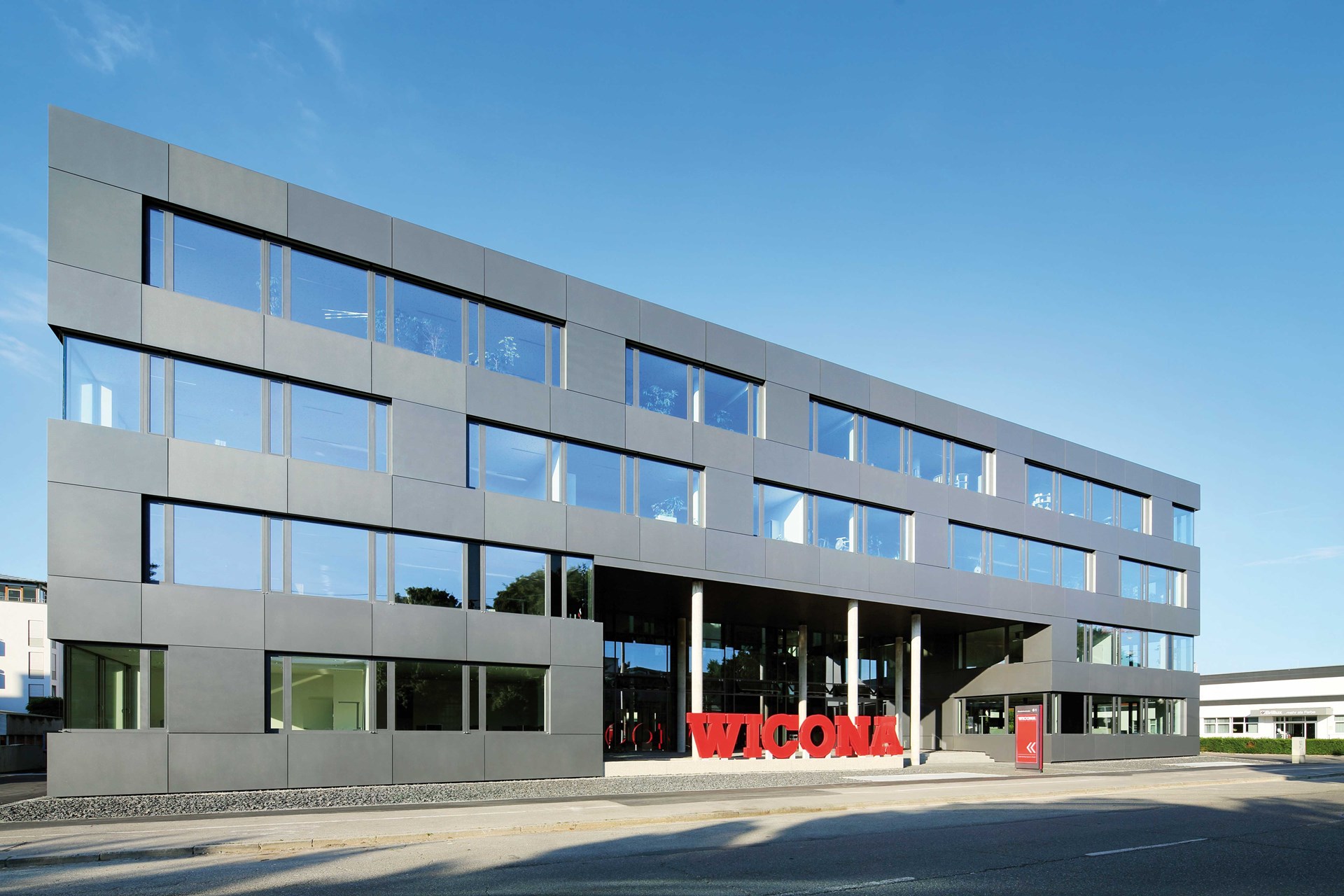
The most eye-catching feature of this striking four-storey building is the high-contrast WICONA logo, which glows red at the eye level of passers-by out for a stroll and drivers. Architect Günter Perl described the basic concept for the new build with its characteristic entrance area in the following way: “This unpretentious buildings responds to the existing, extremely heterogeneous surroundings with an independent inner centre; a centre that signals a welcome and a feeling of security within this otherwise non-exemplary urban district. The large two-storey-high entrance punches through the smooth anthracite-coloured cube of aluminium sheeting with its circumferential strip structured façade and highlights the entry point, thereby creating a suitable lobby area, where the out-sized company logo defines the spatial boundary. The details adhere to the conceptual guidelines: simple and precise.”


